Happy Holidays!

Seasons Greetings from Anne Bryant Creative!

I hope you have a cozy holiday season and a peaceful new year full of happiness, good health, and prosperity. I’ve been fortunate to work with wonderful clients this year and look forward to the year ahead. Happy 2019!

AnneBryant_fox.jpg

MATS Bootcamp 2015

I had such a good experience last year with Lilla Roger's Make Art That Sells bootcamp class that I'm taking it again! I really enjoyed the variety of the assignments and all of her invaluable insights into the market. Plus having the accountability and community of other artists was very helpful. I see my style develop with each assignment.

January kicked off with a fun assignment—Edwardian brooches! Lilla chose this subject for us because they are full of detail, decorative, retro, charming and easy to draw. They also lend themselves to many different styles and mediums. 

I spent the first week, (the mini), drawing every day, even it was just a little bit or while watching tv (Downton Abbey seemed appropriate). I did these all by hand, playing with pencils and working on a variety of paper colors. I still love using the brush pens the best, they have a really nice imperfect line quality. 

A week later, we got our assignment to create a journal cover with Edwardian Brooch inspiration!
I did some more sketching and had an idea that incorporated some text, but after working on it for a while I went in a different direction. The text version seemed too busy and not strong enough—I wanted to make it more fun. Lilla also gave us color palette inspiration which was great for me, because I was feeling like I've been in a color rut. 

This is the color palette Lilla gave us which was inspired by a window display in New York.

This is the color palette Lilla gave us which was inspired by a window display in New York.

The new direction I worked on was this sketch of a bold cat face with jeweled flowers bursting from its head. I really liked drawing the animals and insects during the mini. 

This guy inspired me too (when he's not sitting on my work).

This guy inspired me too (when he's not sitting on my work).

Next, I worked on top of the pencil sketch with tracing paper and the brush pen. Once I have all of the pieces, I scan them and take them into Illustrator where I make them vector art. I also painted some new background textures to add to my library.

Then I play with the palette and layout, using lots of layers to keep everything organized and easier to work on.

Here is a screen shot of my working file.

Here is a screen shot of my working file.

As I work, I often send versions to my friend Cindy who is also taking MATS and she gives me great feedback. She suggested to add more texture and make the kitty's collar jewel a mouse instead—so fun! Once I had the cover designed, I worked on the layout of how it will look in the gallery. I mocked up the design elements on a pencil and added some text—the word 'sparkle'.

Here is the final design. I think a tween girl would totally dig it, (or maybe a 'not so tween' girl as well)!

annebryant_jan15_MATS

Rainier Beach Pride

In December I participated in our neighborhood Holiday Bazaar which was a lot of fun! I sold a bunch of my Modern Homesteading notecards and got to see a lot of my great neighbors. We live in the south end of Seattle and we have great views of Lake Washington, the Cascade Mountains and Mt. Rainier. Our neighborhood is very diverse and full of many creative folks. 

Here's a pic of me setting up. I had fun figuring out how to make a nice display of my products.

Here's a pic of me setting up. I had fun figuring out how to make a nice display of my products.

I also sold some of my illustrations as 8 x 10 art, printed on gorgeous paper and ready for framing. I thought it would be fun to create a new illustration especially for this event to celebrate our neighborhood, Rainier Beach. Here is the rough sketch: 

And here is the final piece. I chose vibrant colors that would work in either a boy's or girl's room.

July MATS Assignment: Beveridges

Our final assignment for the Lilla Rogers Make Art that Sells Bootcamp was a fun subject matter: Beveridges! And not only that, but to create a piece of art for our OWN personal collection, not a client. The purpose of this assignment was to get back in touch with our own creative core and not worry about about satisfying someone else's criteria—to have FUN! 

I really liked the process I used for the last assignment where I drew everything by hand with a brush pen and then reworked it in Illustrator. So I took that approach for this assignment and I am very happy with the results. Just in the short time of the five Bootcamp classes, I can see my own style evolving.

Since it's summertime, I spend a lot of time on the patio enjoying my garden and cold drinks. So here is my final piece inspired by sunshine, warm days and relaxing. I really like how loose and easy it feels. Lilla helped me not stress so much when I'm creating and just enjoy the process.

You can see all of the final artwork for July HERE.

So, what's next? I'm excited to participate in the 2014 Global Talent Search presented by Lilla and looking forward to challenging myself and learning from a new assignment, plus seeing all of the amazing work by the other illustrators. Stay tuned...

June MATS Assignment: Nautical, Sealife, Marine

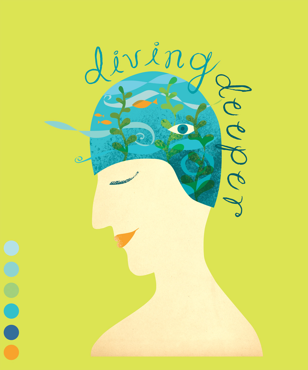
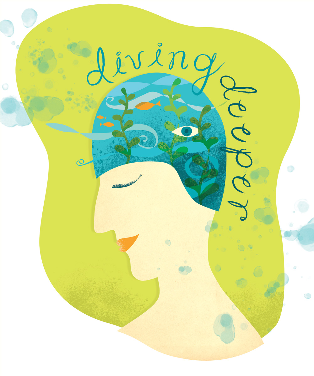
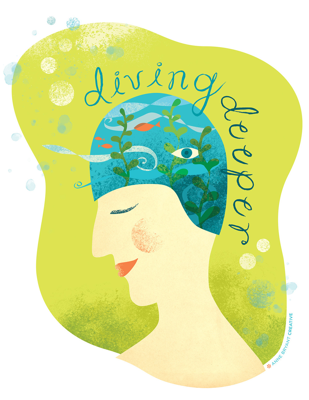
Lilla kicked off June with another fun and unexpected subject for the MATS mini: all things nautical (ship in a bottle, whales, sea-life—basically anything in the ocean!) She chose this theme because it has been trending very strong for summer and she knows what's hot.

The assignment, or application, of the artwork was to create a piece of wall art. She showed us a bunch of different styles from collage, hand-drawn, type-centric, distressed, vintage, realistic and more! Wall art is a great way for artists to get their work licensed so this was a good opportunity to give it a try.

One suggestion Lilla gave us this time was to do it in our favorite way rather than trying something new. I appreciated this and her advice: "Because there is a time to stretch and a time to feel safe and secure in art. Build on your successes for now." (awww, group hug!)

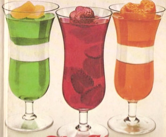
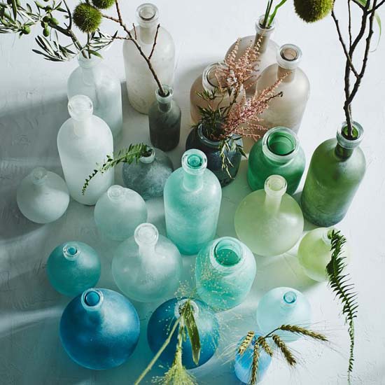
Lilla's final tip for June was to try a watery color palette with aqua blues, greens and putty/neutrals. She gave us some examples of these colors and how they are trending, such as these lovely bottles from West Elm:

Sooooo, without going into a litany of excuses, because really who cares—we all live busy lives and often feel maxed out—I didn't do ANY of the mini this month. So Lilla's tips on creating it in your comfort zone helped me dig right in when I did have time to spend on it. Having the time to mentally percolate on something for awhile before you put pen to paper actually really helps expedite the process. I know it does with my design work.

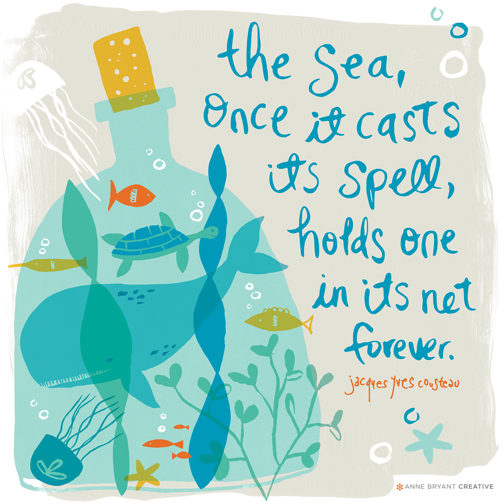
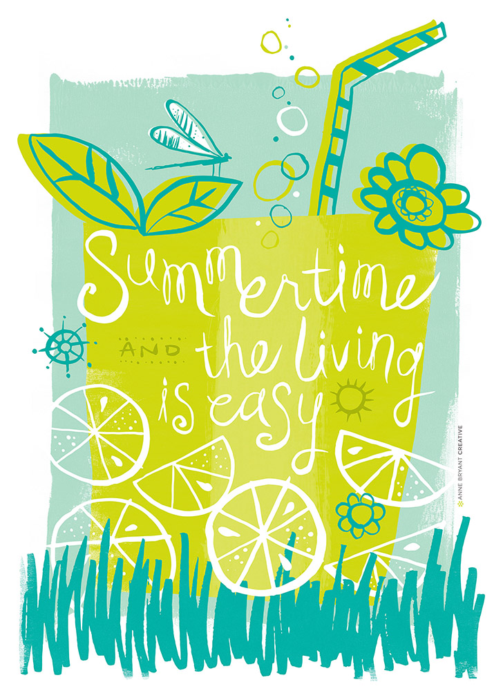
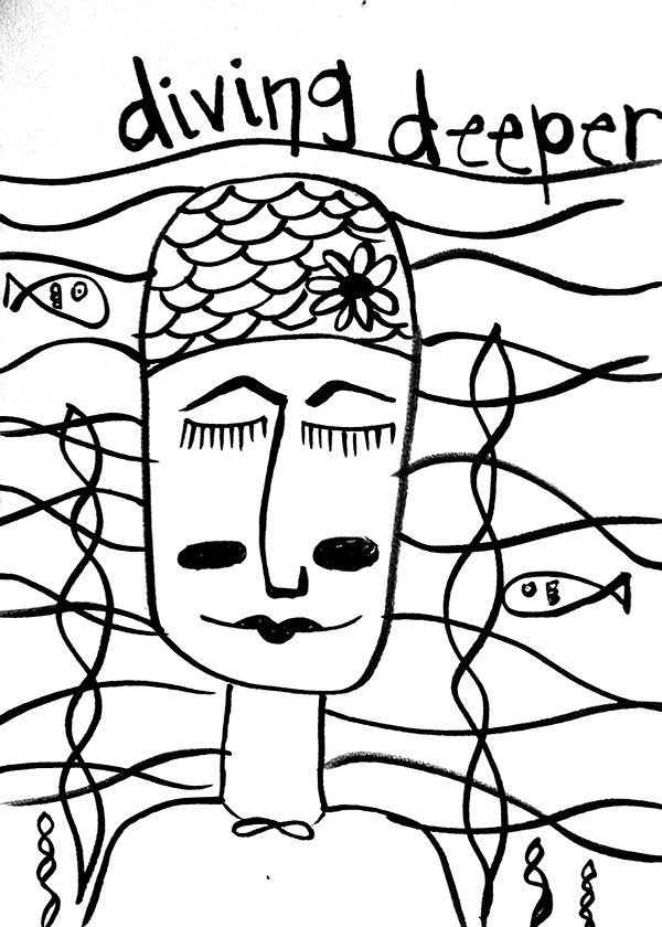
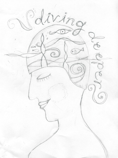
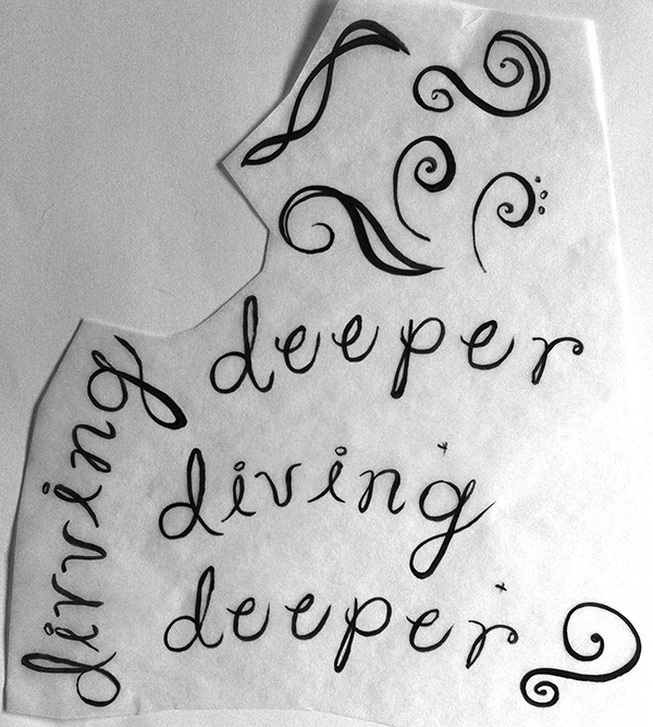
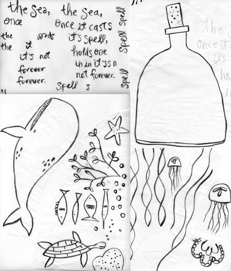
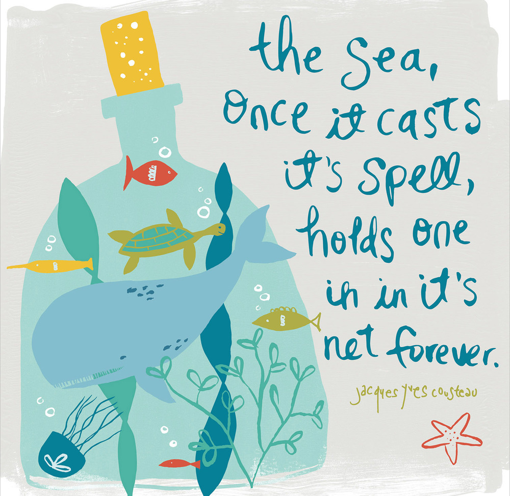
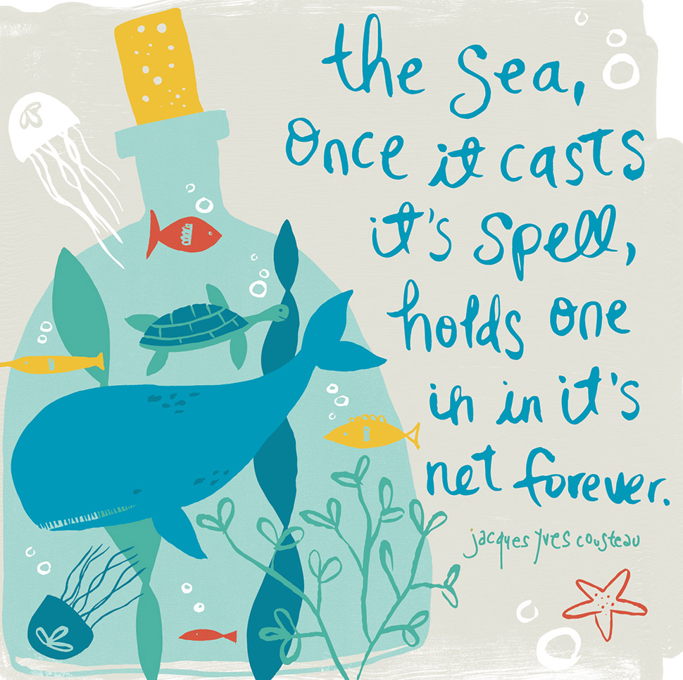
I did some sketching and quickly come up with the idea of creating a marine scene, featuring a whale and because I LOVE text, I wanted to do some hand lettering. So I found a quote by Jacques Cousteau which I incorporated into the layout.

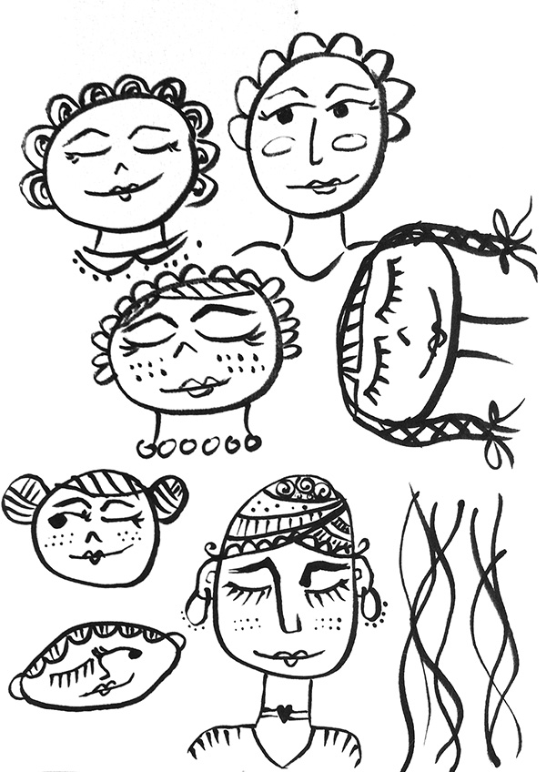
I started by scanning in my drawings, done with a brush pen, into Photoshop, where I adjusted the levels until the artwork is black only and has nice clean edges. These are some of the raw scans, before they've been adjusted:


Next I took all the scans into Adobe Ilustrator where I used the image trace palette to convert my drawings into vector artwork. I like having them as vector because then they can be scaled and adjusted easily.

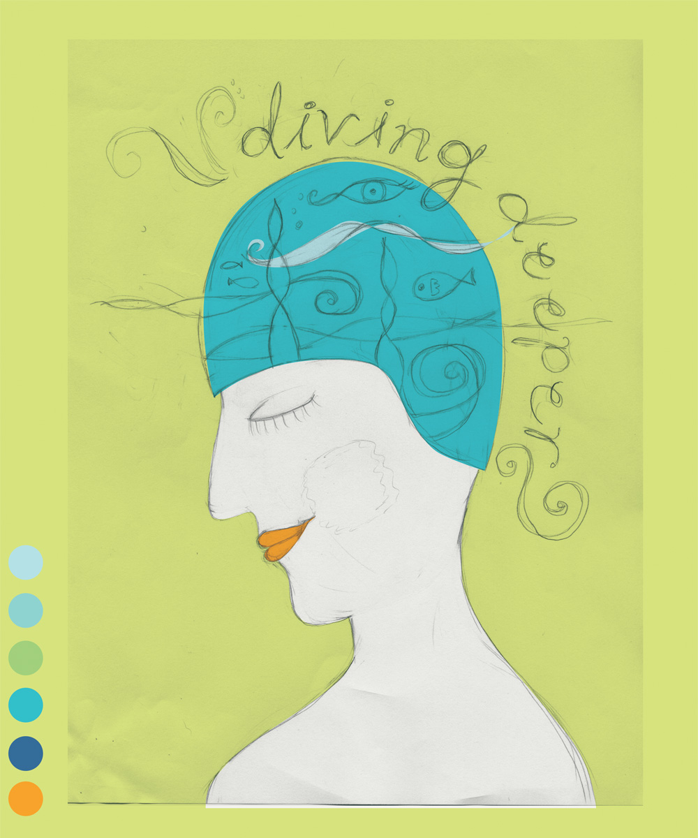
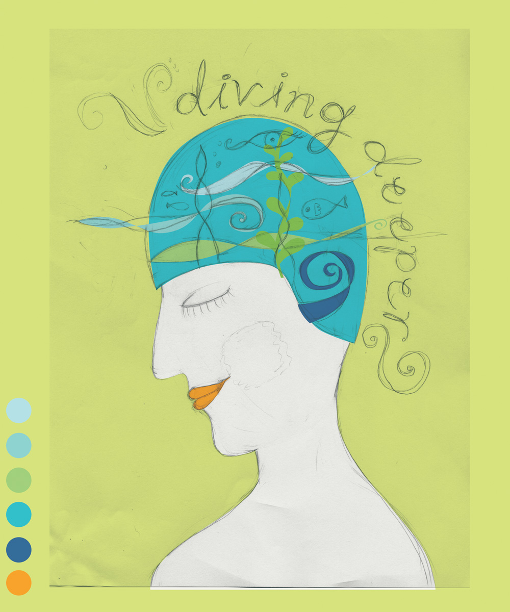
I quickly worked up the layout and sampled colors from the inspiration photos to create color palettes. Here's the design evolving, along with a screen shot of my Illustrator document. I like to keep all the pieces in the same document so they are easy to work with.


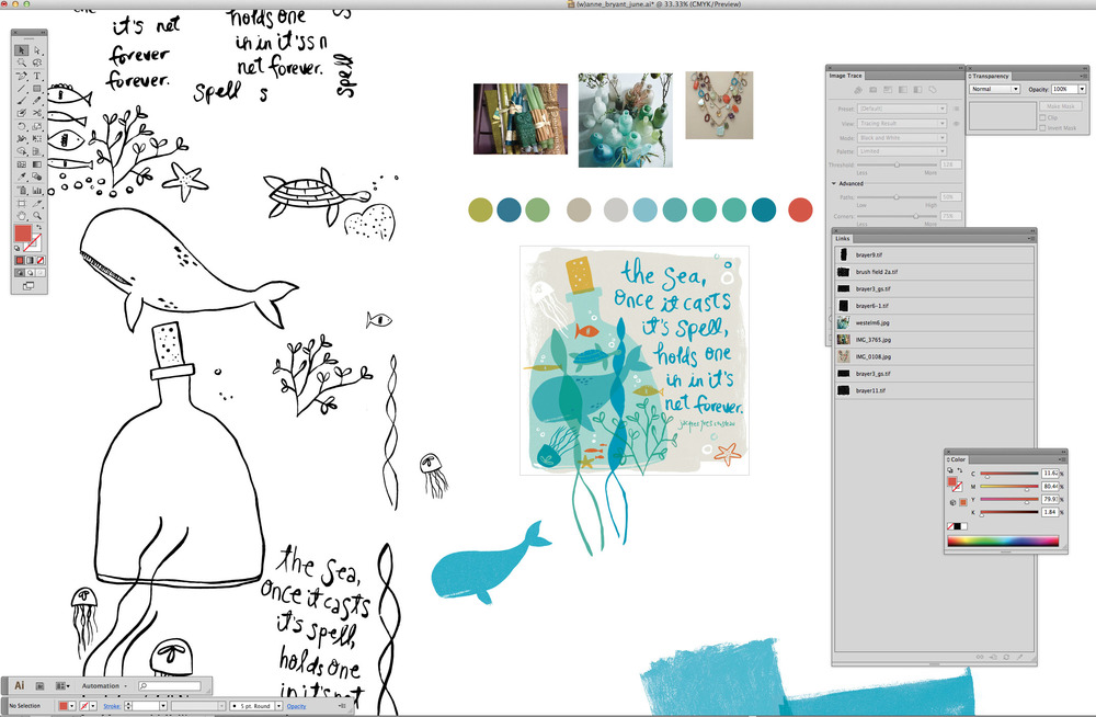
I have a number of textures scanned in to my library that I use as background elments and to add texture. Tip! If you make them a black only bitmap tif in Photoshop, then you can colorize them whatever you would like in Illustrator.

While I was figuring out the composition, I decided I didn't like having the edges of the putty colored background shape cut off, so I shrunk everything down a bit so the organic edges of the shape weren't cropped. I also added some transparency with the sea grasses. 

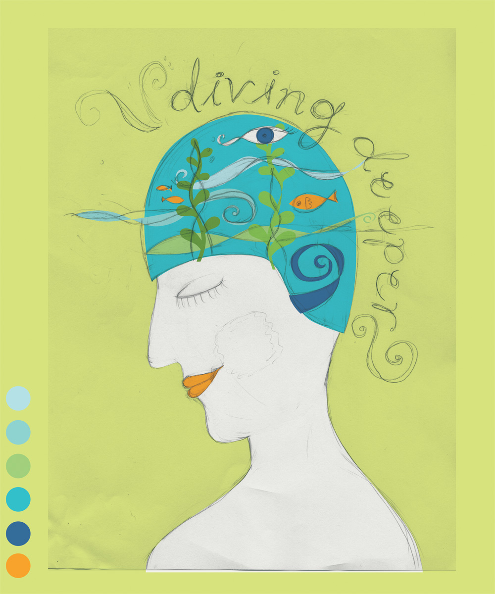
Here's the final piece!


KCSARC Celebrates

A couple of months ago I had the honor of creating a special piece of artwork for my client King County Sexual Assault Group, KCSARC. I've worked with them for a number of years creating the materials that support their annual fundraising events. This project was the first time they commissioned me for artwork so it was very exciting!

They wanted to do something special to honor one of their staff who has been there for 30 years and has created quite a legacy of helping her community. While I haven't met DeAnn personally, I met with my client and we talked about all of her contributions, her personality and she even sent me a couple of photos of DeAnn's office so I got a sense of her style. One thing that resonated with me from our conversation was that she LOVES funky shoes and it is kind of her signature style.

I came up with some sketches of the timeline for my client and they went with my favorite which was the funky boot, jammed full of turning gears, books and musical instruments that showed both DeAnn's personal and professional sides. Originally it was going to have a quote, but they decided not to in the end.

I used a local company, Bumblejax, to print and mount the final 15 x 20 inch piece to bamboo which looked awesome!


May MATS assignment: Faces & People

I'm back, working on our May 'Make Art that Sells' course with Lilla Rogers after having April off from the class. During the month off I got to do a really neat illustration assignment for one of my regular clients. I will show it on my blog once it goes 'live' to the public.

This month for MATS our assignment was to draw faces & people! Lilla gave us some photos of dolls to draw from first because drawing actual, real life people can be a bit daunting. I was so swamped with work, I never got to the dolls, but instead I started drawing faces—fun, silly and all different shapes and sizes.

After the first week of sketching, we got our assignment which was to create an illustration for editorial use—specifically an illustration for a magazine to go with this article on meditation. Lilla gave us lots of great tips on how to come up with ideas for our illustration such as: writing down a list of items that come to mind while reading the story, taking mental 'snapshots' of scenes, making it tell a story, and paying attention to the title and subheads in particular.

I read the story and did some sketches in the sunshine on the patio, enjoying a margarita and good company.

The subhead 'Diving Deeper' in the story resonated with me and I liked the idea of how through mediation you explore your subconscious while your "mind's eye" wanders. I liked the swimming and water imagery.

In my sketches I had the woman's face straight on, but I thought it would be more interesting in profile. I did a fairly quick pencil sketch and then scanned it into the computer to play with color and textures.

Here is a series of shots of my process:

 Original sketch:

I prefer hand drawn type and it's imperfections over a font. I use a pen with a brush tip on a piece of tracing paper of the drawing to figure out how I want it to look and then scan it into Photoshop.

Blocking in color and figuring our color palette in Photoshop. I use 'paths' to create all of the shapes on many separate layers and then fill with color and mask in textures. 

Adding detail:

Mostly blocked out, now working on figuring out the balance of the imagery.

Figuring out background. I felt like the splatters were a bit too busy:

And this is the final image. I'm really happy with it and felt like it came together pretty quickly. Our final tip from Lilla was to try a blue inspired color palette which luckily I already have done! MATS  is teaching me to work more efficiently and enjoy the process—not stressing out over it, because as Lilla says, 'Have fun! People buy your joy!' 

March MATS assignment: Jell-o!

I just wrapped up the March assignment for our Lilla Rogers Make Art that Sells bootcamp project. Our assignment was to create a pattern for bolt fabric inspired by jello and jello molds—how fun is that? I admit, it has never occurred to me to draw jello before, although being from the mid-west I have had my fair share of the jiggly stuff.


I started off with my usual process of drawing and sketching but it just felt too heavy for the transparency and bold colors of jello. So I started cutting up bright colored papers and using modge podge to get some layering between them. Tissue paper really gave them a nice effect. When I think of jello, I think retro, and being a lover of mid-century modern and the artwork by Alexander Girard, I wanted to try something inspired by that era.

These are some of the collages I made with paper:

I really liked the look of these—simple, bold and graphic, plus the transparency. But I knew that creatiing the entire pattern by hand wouldn't be an efficient method for the final design. So instead, I cut multiple shapes of black paper with an exacto knife that I then scanned into the computer and created vector artwork that I worked  with in Illustrator. This gave me a lot more flexibility to layer, play with colors and create a repeating pattern. I still was able to keep the imperfect line work that I wouldn't have if I created everything from the start on the computer. 

My first instinct was to go BOLD with the color. Jello inspires an ultra bright and artificial palette in my mind, so I started here:

A week later we got our color inspiration palette from Lilla which had very desaturated colors, she called it a 'nougat' palette. It was very lovely, but so different than the bright colors in my design. 

But I really wanted to try it, I gained so much from pushing my color choices in the first project. This was my design with the more desaturated palette:Wow, such a different feeling! It felt more sophisticated, less garish. I liked it, but still loved the boldness of the original palette. After working on it more, I ended up with this as my final design. The palette is a little bit in the middle, plus I added some texture in a few of the shapes:

I also created these two coordinate patterns for fun:

This assignment was really fun and I enjoyed this new paper cutting technique. I have a feeling that each of my bootcamp assignments will look completely different as I seek out 'my' style. We have April off so that will allow me to focus on some other projects, including the design for my neighborhood garden tour. The gallery of all the artists jello designs will be live tomorrow and from what I have seen they are all so different and inspiring! 

Update: Here is a link to the MATS March gallery.

February MATS assignment: Cuckoo!

I finished my first assignment for the Lilla Rogers MATS (make art that sells) course last week and had a week off which was good because I was busy with my client work. The gallery went live on Tuesday with all of the amazing and diverse artwork. You might think that if 400 + people are all drawing cuckoo clocks, there might be some similarites, but no! They were all SO different and fun. You can see all of the final designs here in the gallery.

My design was inspired by my sketches from the previous week, in particular, my treehouse gouache sketch that I posted below. I did all of the line work for the final by hand, scanned it in and then added colors and textures in Photoshop. Lilla's color palette suggestions inspired me to try some new things and I really like the pop from the chartreuse green.

We get our March assignment tomorrow, so on to another inspiring month of drawing!

Hellooooo...

Anybody out there? My blog has been in deep hibernation for too long. I'm waking it up and sharing the news that I have recently kicked off Lilla Roger's Make Art that Sells Bootcamp. I get so busy with my design clients, that it's hard to make time for my illustration work. By committing to this six month long class, I'll have deadlines, accountability AND support from awesomely talented illustrators all over the world!

Our first assignment was to draw cuckoo clocks—how fun is that?! I spent one week just sketching and playing with styles and materials. Now on to our first assignment—translating our illustrations onto a cell phone case. Stay tuned for more on this fun project and updates to my design portfolio.

Homemade Holidays

It's hard to believe, but 2011 is coming to a close which means this is the last desktop calendar in my Modern Homesteading series. I hope you've enjoyed them and that they've brightened your workspace throughout the year! Many thanks to Willi Galloway from Digginfood for collaborating with me on this project and for sharing my illustrations on her blog. Be sure to pick up a copy of her beautiful book, Grow. Cook. Eat: A Food Lover's Guide to Vegetable Gardening that is coming out in February 2012.

In case you miss having my illustrations at your fingertips, don't worry! You can find all twelve illustrations available as a note card set that you can find on my Etsy site. They even come with stickers and in a cute little drawstring bag. Perfect for hostess gifts or stocking stuffers!

Have fun and save money by crafting up your holiday decorations with things found in your garden. Here is a pic of one of the wreaths I made last year with things found around my yard and neighborhood. 

As always there are three sizes of the desktop calendar to choose from. Just select which one fits your monitor and click on the link to automatically download the file. I hope you have a peaceful and warm holiday season! 

1024 x 768

1600 x 1200

1920 x 1200

It's Knitting Time!

It's that time of year when I switch from my outdoor hobbies to indoor hobbies. Luckily our winters in the Northwest usually don't get too bad until late November or December, so I am still able to get out and do some gardening projects. Last weekend I harvested the potatoes and put in a new flower bed. Hopefully I will get around to planting some bulbs for spring blossoms.

Once I put away my gardening tools for the seaon, I will be whipping out my knitting needles and get cranking on some cozy projects. I picked up several books from the library to try to learn some new stitches—so far all I've ever knitted are pretty simple scarves, but maybe I will get more ambitious.

Here's a pic of my dog Murray modeling a scarf I knitted a couple of years ago. The needles I used are huge and I love how fast it knits up with the LionBrand 'thick & quick' yarn.

Below are the links for the three sizes of the desktop calendar. Just select which one fits your monitor and click on the link to automatically download the file, then set it as your desktop image.

1024 x 768

1600 x 1200

1920 x 1200

Get Hoppin'


Fall has officially arrived in the Northwest—crisp nights, golden leaves and my garden is starting to fade a bit. There's still a lot hanging on, showing off their colors like the purple asters, yellow dogwood and golden hops that grow up a trellis at the back door. The golden hops are actually more of a brilliant bright green, and right now they are putting all of their energy into making the cute little flowers that hang like lanterns in clusters. 

In my little neighborhood I have two neighbors that brew their own beer (I know, lucky right??) so I offered some of the hop flowers to see how they would brew. Today I picked a colander full and put them in the freezer as I was instructed—hopefully they make for a flavorful batch of beer.

As always there are three sizes of the desktop calendar to choose from. Just select which one fits your monitor and click on the link to automatically download the file. Cheers!

1024 x 768

1600 x 1200

1920 x 1200

Fall Forage

It's September and time for a new calendar! The weather lately has definitely been feeling more fall-like with cooler days and crisp nights. In the garden, I pulled out all of my summer lettuces that were going to seed and planted some fall veggies: broccoli, bok choy, lettuces, collard greens, spinach and more. Hopefully we'll get some more tomatoes before it gets too cold.

In the Northwest a lot of people go foraging for mushrooms in the fall. The forests here are a perfect growing place for many varieties. Last year my husband went with some friends and came home with a bunch of matsutakes and chanterelles—yum! The Puget Sound Mycological Society even has a Wild Mushroom show in October that is really interesting. 

As always there are three sizes to choose from. Just select which one fits your monitor and click on the link to automatically download the file. 

1024 x 768

1600 x 1200

1920 x 1200

Design Improv

One of the highlights of my summer was taking a two day class at Pacific Northwest College of Art taught by designer/quilter Denyse Schmidt. I've followed Denyse's career ever since I saw an article on her in Martha Stewart's magazine about 10 years ago. While I love fabric and quilts, I've never actually made one—I do sew, but consider myself a novice and generally use a 'figure it out as I go approach'. The class was a great opportunity to learn not only from Denyse, but other talented women—there were about 16 people in the class in all—some from the Northwest, but others from all over.

The first day we spent making three improvised blocks by drawing pieces of fabric from the three different bags—small, medium and large. We had to use whatever random piece you pulled which produces unexpected results and happy accidents. After we did those three blocks, Denyse talked about the components to design and things to think about as we sketched ideas for a series of blocks that would make up a whole quilt. 


At the end of the second day we all put our blocks up on the wall and talked about the process, what we liked, didn't like, what suprised us and where we'd take them next. Some people did a ton of blocks, I'm a little slower and got three done but look forward to doing more. It definitely made the idea of making a whole quilt less intimidating.

Detail of one of my 'garden' blocks

During this time my friend Tara Bliven from Ephemera Press had this cool idea for a project she called The Elevated Envelope. The idea was to create something fun that you could send in the mail to 10 other people and the theme was 'Summertime'. Following on the heels of my quilting class, I thought it would be fun to take the same techniques but use paper—randomly pulling pieces out of the box and then working with what I had. Again, it was so surprising to see these combinations and juxtapositions appear that were way more interesting than anything you could ever plan. Here are some photos of the envelopes I made. Because of the somewhat fragile nature of the finished envelopes, I mailed them in glassine envelopes for protection.

Stitching the paper quilts

Fronts of the 'quilt' envelopes
Backs of the 'quilt' envelopesDetail of envelope front

Detail of envelope backDetail of envelope front

Canning Time

It's August which means you probably have a lot of bounty from your garden and want to hold on to it for those long winter days. Canning and preserving are a great way to enjoy those summer flavors through out the year.

You can pop over to Willi Galloway's blog, Digginfood for a great recipe for Refrigerator Pickles. I hope I get some cucumbers sometime soon so I can try it out!

As always there are three sizes to choose from. Just select which one fits your monitor and click on the link to automatically download the file. Happy canning!

1024 x 768

1600 x 1200

1920 x 1200

Garden Goods

Here in Seattle summer weather usually doesn't arrive until after the fourth of July. This spring and summer have been no exception, but it's finally starting to heat up thankfully. Even with the cooler, wet weather our garden has been exploding, especially the leafy veggies like lettuces, kale and chard. The peas have been pretty happy too. I'm already on my second crop of spinach after the first one came early, then bolted.

At our house we have a veggie garden and herb garden in our back yard, just steps outside our back door which is awesome. Last summer we put a raised bed in our alley which is great for plants that like full sun and hotter temperatures. We've got some green tomatoes, beets, carrots, squash and brussel sprouts which are crazy looking if you've never seen them outside of the market. Here is a little tour of our garden for you.


I hope you enjoy the July calendar and the bounty in your own backyard. I'd love to hear what's growing in your own gardens! As always there are three sizes to choose from. Just select which one fits your monitor and click on the link to automatically download the file. And be sure to visit my friend Willi Galloway's blog Digginfood for great gardening tips, recipes and other fun stuff—you can also find my calendars for download there.

1024 x 768

1600 x 1200

1920 x 1200

Fresh Eggs

There are a lot of backyard chicken coops here in Seattle—I know of at least four in my neighborhood and there are probably more. In fact, there is even a coop tour on July 9th. If we had a good spot for one I'm sure we'd have one too, but for now, we enjoy visiting the neighbor's coops. This month's calendar is one of my favorite from my note card set and I hope you enjoy it too.

As always there are three sizes to choose from. Just select which one fits your monitor and click on the link to automatically download the file. And be sure to visit my friend Willi Galloway's blog Digginfood for great gardening and food tips—you can also find my calendars for download there.

1024 x 768

1600 x 1200

1920 x 1200